Perky
Branding, packaging, physical mockups, menu design, illustration
Perky is a coffee brand that was created for Graphic Design Studio I. It started as an illustration of a chosen object (coffee pot) and developed into an application (coffee shop brand).

Overview
This Graphic Design Studio 1 project started with several illustrations of an object of interest after exploring the design principles and how to apply them to graphic design specifically. I chose a coffee pot because of my love for specialty black coffee. I explored different angles and compositions of my coffee pot and machine.
Challenge
The illustrations had to eventually be applied to something in an abstracted or unique way. The challenge of this was to let the design profess flow instead of forcing it into one direction, like a specific application.
Approach
The first part of this project was to choose the project we wanted to draw in different angles. The next step was to take the ten best illustrations and develop them into more abstract or well thought out compositions in black and white.
A color scheme was then added to my compositions. Green was chosen as the main color because it is the true color of the chosen coffee pot, and it is my signature color.
After an in-progress critique, it was agreed that these designs could be pushed much further. Choosing an all-green color scheme was the easy route. The designs needed to be pushed outside the box, and abstracted in a unique way.
Design Refinements
The designs evolved with the integration of implied shapes and textures, introducing a new visual direction. Extensive color theory research was conducted to determine the most effective palette, ensuring alignment with the intended message and aesthetic. Additionally, a thorough analysis of the target market was performed to enhance the design’s impact and applicability. Strategic color choices played a crucial role in defining the audience and reinforcing the overall visual communication.
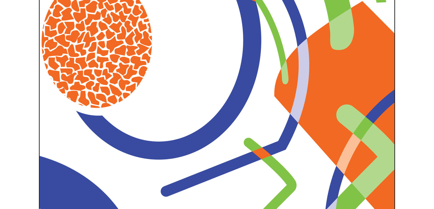
The final illustration composition was chosen, and he audience was decided to be people looking for a friendly and energized coffee shop/cafe vibe. Colors were explored that had a strong energy and comforting feel. Adobe Color helped to analyze the best contrasts and pairings.
With the finalized illustrations, it was time to move on to applications. The application could be anything from packaging to a book, as long as it utilized the illustration from the found object.
The application I chose was a coffee brand. The coffee brand would be called Perky, and print materials, digital mock ups, and physical mockups would be created.
The Perky branding started with a brand mascot using the coffee pot, and it was placed over the coffee pot illustration.
Outcome
From illustrations to final mockups, this project pushed me harder than any project before. the most valuable lesson I learned is that it's ok to step out of my comfort zone. It was challenging at first for me to branch out beyond just using green, but I'm glad I am pushing myself to be a more well rounded designer. Through my extensive exploration of color schemes, I learned a lot about color theory. Certain colors looked heavy or staticky next to other colors, so I learned how to trouble shoot those issues. The construction of the mock ups was a new challenge, as it was my first time working with professional printing and die lines. All of the new challenges of this project pushed me so hard, and I am very grateful for that.


