top of page

Icelandair
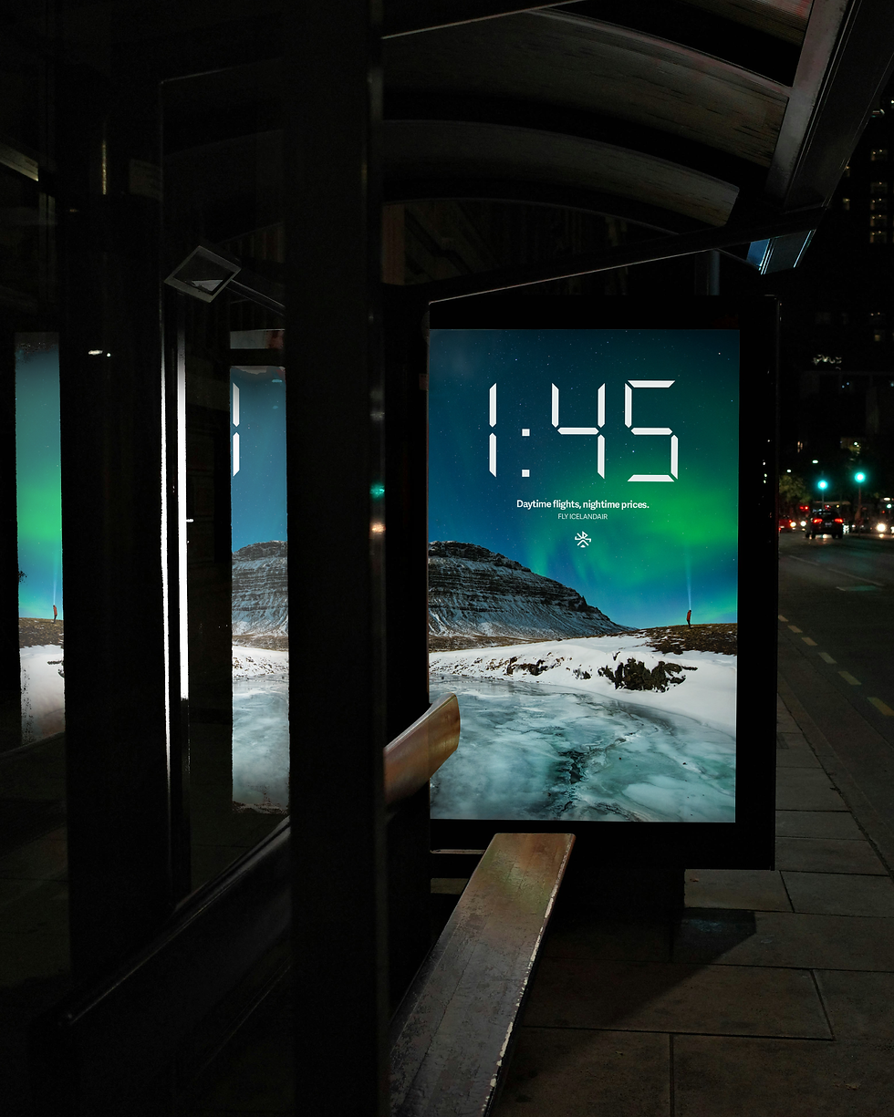
This proposed identity for Icelandair aims to bring the authentic experience of Iceland to a traveler from the moment they book their flight to when they step off the plane by being cohesively branded at every touchpoint.
Brand identity, ux design, ads, screens, environmental graphics

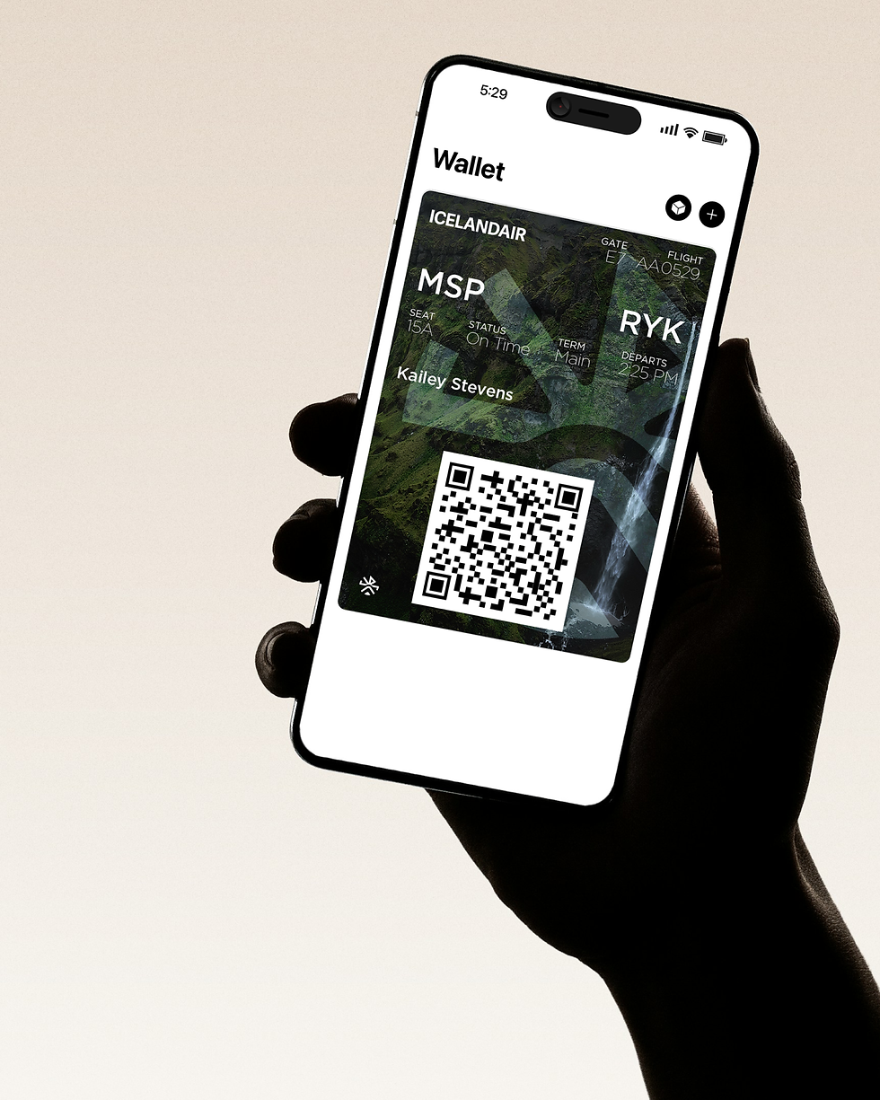
Experience Iceland From the Airport Gate
This rebrand proposal brings a whole new light to Icelandair. From a logo that lacks connection to Iceland itself to a brand that feels cohesive down to every touchpoint, the brand has been repositioned to feel like Iceland from the gate.
BACKGROUND


A Deep Story to Connect
to the Mission
Iceland has a unique history, with its Viking roots and rugged landscapes that look otherworldly. Icelandair had the opportunity to stand out through these aspects, so I took them into account as I researched Iceland itself. Through analysis, I discovered the symbolism behind the Viking Runes (symbols the Vikings used) and combined them into a mark. I also make sure to use visuals and language of Iceland itself, so their airlines experience feels like Iceland the whole way.
OPPORTUNITY


What I Did
Icelandair's experience needed to feel like Iceland from the moment the travelers stepped into their gate. From the boarding pass to the exterior of the plane, everything was designed to bring Iceland along the whole way through a cohesive design that brought a modern take to Iceland's history.
BUSINESS STRATEGIC APPROACH


bottom of page