
Icelandair
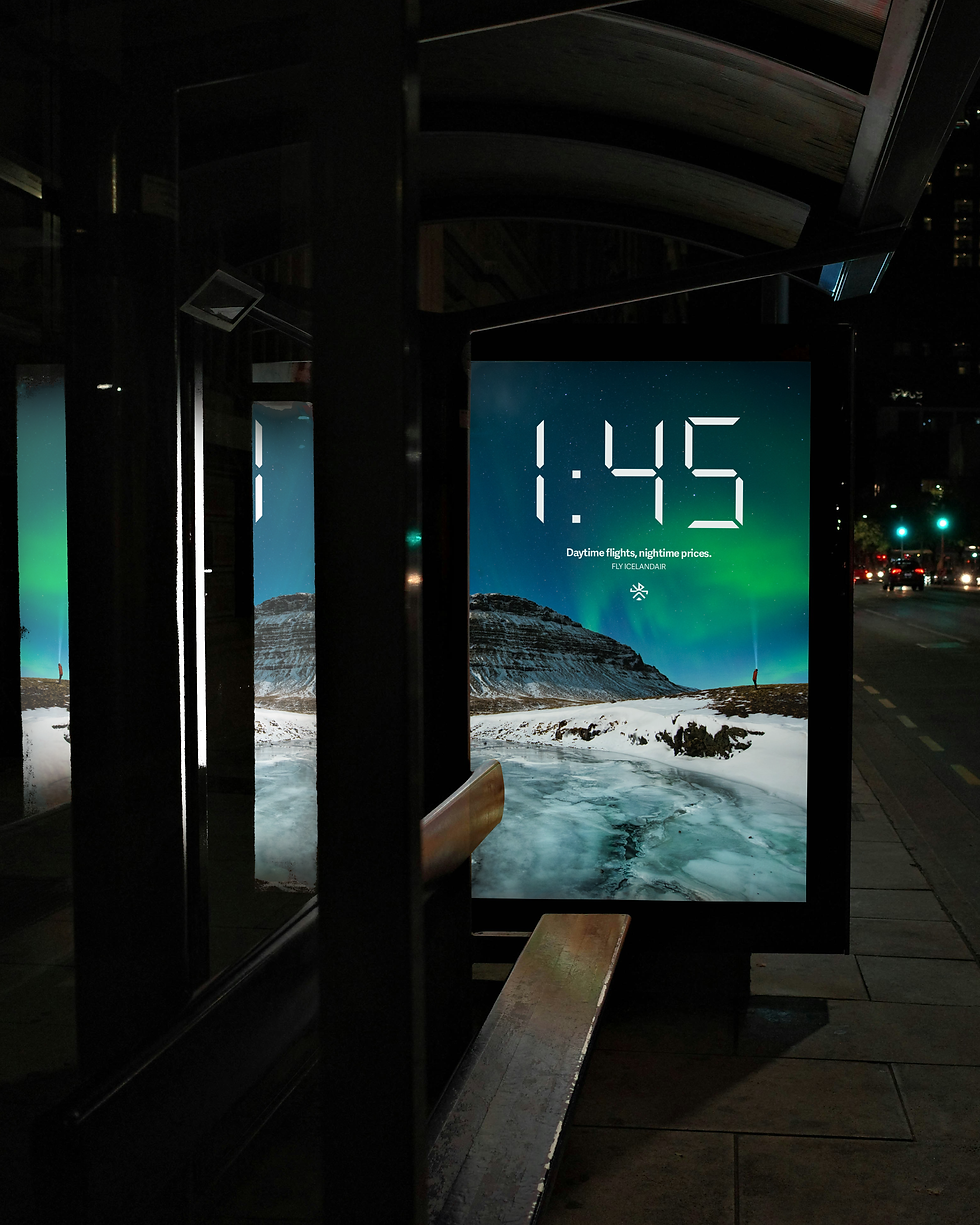
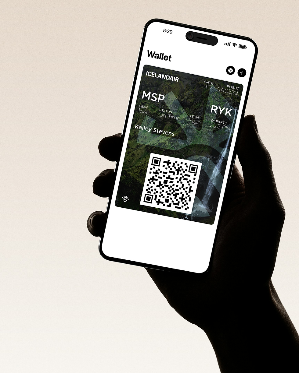
This proposed identity for Icelandair aims to bring the authentic experience of Iceland to a traveler from the moment they book their flight to when they step off the plane by being cohesively branded at every touchpoint.
Brand identity, ux design, ads, screens, environmental graphics

HUB (Humanity Unlocking Biomaterials) connects top researchers with diverse talent to advance biomaterials research, supported by the NIH and led by the University of Michigan and the University of Washington. Inspired by bell hooks’ concept of centering margins, HUB bridges gaps between established scientists and underrepresented individuals. The branding process included research, market analysis, and community-focused design. The logo, refined through sketching and iteration, features a merging cell for unity and surrounding circles for diversity. A bold typeface reinforces HUB’s authority and innovation, while iterative refinements ensure the design reflects its mission.
BACKGROUND


A Deep Story to Connect
to the Mission
HUB's mission is full of deeper meaning, and connects to the message of bell hooks. These values needed to be represented in the visual identity. Therefore, the logo is a visual representation of a scientific approach on centering margins.
OPPORTUNITY


What I Did
To highlight HUB's mission, we created a brand identity that connected to their audience of engineers and scientists. The identity feels scientific, innovative, and like a cohesive community.
BUSINESS STRATEGIC APPROACH
Related Projects
If this caught your eye, so will these:

Visual Identity
Port Patch

Branding, Illustration, Mockups
Perky

Branding & Pitch
Fundr

Branding & Web Design
BME Unite


