
BME Unite
Brand identity, web design, graphics
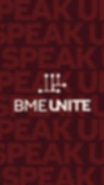
BME Unite is a bold community of activists in the Biomedical Engineering field. They recognize and strive to make real change to center margins in research. The logo, a rebrand of their old fist logo, abstracts the ideas that they stand for.

BME Unite is a collective of biomedical engineering (BME) academics dedicated to advancing health as a right for all. Seeking a refreshed visual identity, the organization wanted a logo that symbolized unity, science, and connection in a more distinctive and innovative way. The previous handshake icon, used since 2020, lacked uniqueness and modern appeal. To create a meaningful design, I conducted in-depth research on centering margins, scientific branding aesthetics, and social justice visual language. Market analysis revealed a balance between clean, innovative design and the more dynamic, community-driven feel of social justice brands.

The sketching phase generated a broad range of ideas, later refined for readability, scalability, and symbolic strength. The client received five distinct concepts, from conservative to bold, easing leadership’s transition from the old logo. Each design was presented with a symbolic breakdown, ensuring alignment with BME Unite’s mission of unity and empowerment. The final logo and visual identity establish a powerful presence, reinforced through the BME Unite website, which presents key information with clarity and cohesion. Explore the full design at bmeunite.org.


Related Projects
If this caught your eye, so will these:

Branding, Illustration, Mockups
Perky

Branding & Web Design
HUB

Branding & Pitch
Fundr
Branding & Web Design
BME Unite